THE BINA GREENE METHOD: 5 MINUTE LAYOUTS

((Most of my layouts are 5 minute layouts and finished within 5 minutes of starting PSE.
They are memory pages mostly and might or might not evolve into full blown scrapbook pages one day.
Memory pages record the story and the photo they are not very concerned about ornateness.
The method is as simple as they come and meant as a starting point to develop your own style from. The method is perfect for daily photo journaling and daily memory keeping because it is so concise. It can be extended or reduced to fit whatever it needs to fit: your mood, your style, your preference.
Some planning is involved as to
a. what photos do I want to scrapbook?
b. what supplies do I want to use?
c. what fonts do I want to use?
After you have made the above choices, make a new folder (and call it whatever you want, I call it ACTUAL,) and copy paste your selection into that folder. I copy ellies, papers, pic and possibly fonts into that folder. Then everything is sitting together and you do not spend any time navigating your folders. If that feels too restrictive to you and you want to browse supplies while you are making your layout, go for it but leave your original choices in that ACTUAL folder just for the sake of a quick comparison. Depending on how you have organized your supplies or better yet, where you browse, you may be able to finish a 5 minute page even though you include the browsing of your supplies. I make layouts with styles, patterns and brushes a lot, so that sometimes I do not even need to navigate folders except within PSE, or be it for that odd button or fastener that I love to use.
1. DEAL WITH 1 PHOTO LAYER ONLY
As soon as you have more photo layers you may spend too much time on them, well you might not but I do.
So the way to go is to edit your pics beforehand then collage them to one photo layer and then use that single photo layer for your page. I like to make my collages with the google photos app. Google photos app can handle up to 9 pics for a single collage. That is not too much but it usually does the job. If you really do need more pics on one collage you can combine collages with collages.
I care about photography and whenever I have a below average photo to scrapbook it sure does not get any better by burying it in scrapbook elements. Rather, the contrary is the case: the perfect graphics highlight the shortcomings of the photography in quite an obvious manner. The photo is really the element memory keeping is fostered around. So in order to get the best photo possible, I make the best photo I can when I make it and not in post. But often enough, the worst photos make the best memories and photo editing is a topic that has to be dealt with one way or the other.
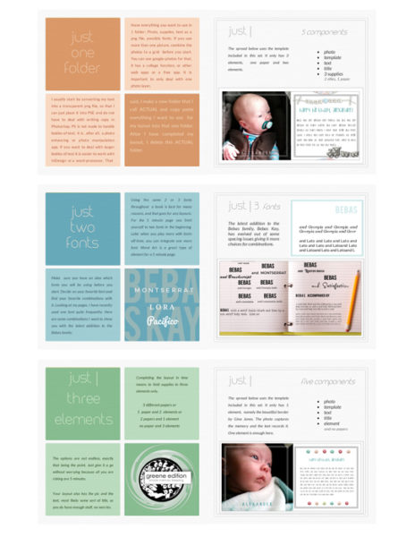
2. USE 3 PIECES OF SUPPLIES ONLY
plus your photo and your text. So that can be 3 papers or 2 papers and 1 ellie and so on. Wordart is a fantastic element for 5 minute pages.
3. REDUCE YOUR FONTS
to 3 fonts max better yet 2 or 1.
There are font hyperfamilies available for free personal use that let you come up with incredibly looking copy generated from one font family alone.
Gone are the days of endless sorting, tagging and searching for just the right font. I have totally stopped doing that so absolutely and altogether, I rely on hyperfamilies, the big font familes that have serif, sans sarif, display and a handwritten, often slabs and what not, and everything goes together.
Remember that PSE or PS are not made for handling large bodies of text. If you want to do that use another app and convert your text to a png file. Instead of converting your text to a png file you can also write it with a word processor or text editor which you would do anyways before conversion, use a simple app like editor which is pre-installed on every PC, and then copy paste it into PSE or any other layout app.
This method is my fave because it really lets me finish a page within 5 minutes or less. As for the copy I often have 5 to 10 idle minutes, on the train or where ever, and I use that time to get my copy straight. I often text into my phone and later on I use that copy as a starting point for my journaling. The copy is usually not that bad because I am out and about when I write it and outdoor copy is arguably better than indoor copy. Dividing up the process is a big help, especially for someone who is newer to journaling. Setting the journaling apart from the memory page layout design is a big step towards a two minute page, believe me.
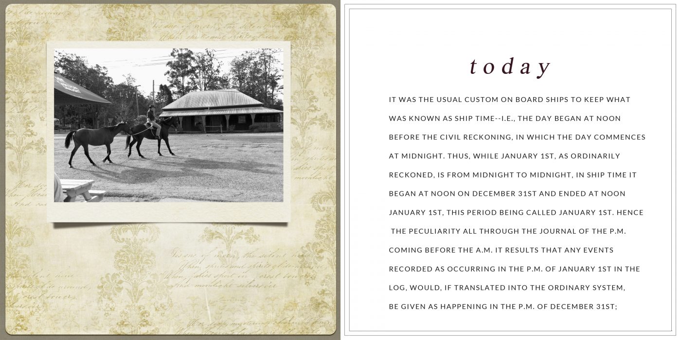
A word on journaling: I usually make spreads, with one photo page and one journaling page. That lets me cut to the chase and leaves space available for both. I rather avoid fitting copy into the layout and if I do I prefer copy in a grid style.
The idea is of course to come up with a page you like to see and that is the most important thing apart from enjoying the process itself, of course.
Following the steps can help you to develop a do-able method of memory keeping and in the end it does not matter if you use more or less components, as long as you stay on top of the process
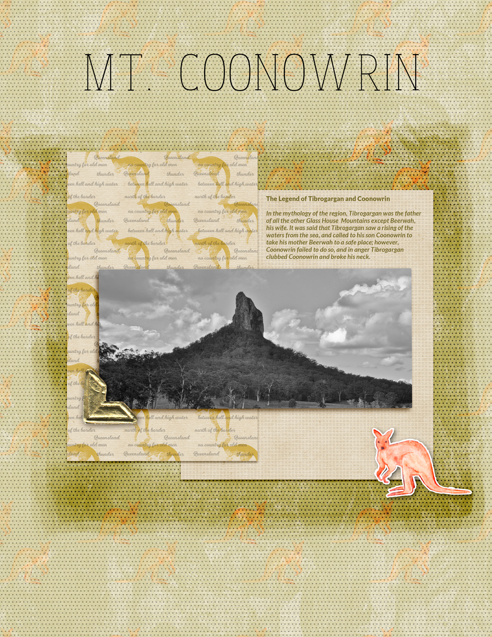
The page below (Mt. Coonowrin) has text, photo, 1 paper, 4 ellies (incl. brushes) and it sure does not follow the pure 3 elements rule and it doesn’t have to. It is supposed to be a starting point to develop from.
You can also read about my process here and here.
Please find the 6×6 template Overlay freebies mentioned above here,
the free 6×8 Album Maker here
and the free 12×12 Lots of Text template here.
There are more freebies in the store.
Get the cheat sheet here
If you decide to sign up for the newsletter you will receive a gift.


